
H.N. WERKMAN DRUKSELS : creative letterpress

Lead Graffiti's H.N. Werkman Creative Letterpress workshop is a contradictory letterpress experience in that you work upside-down, do not use any form of lock-up, and produce an individual print versus an edition. Other than that it is pretty much the same.
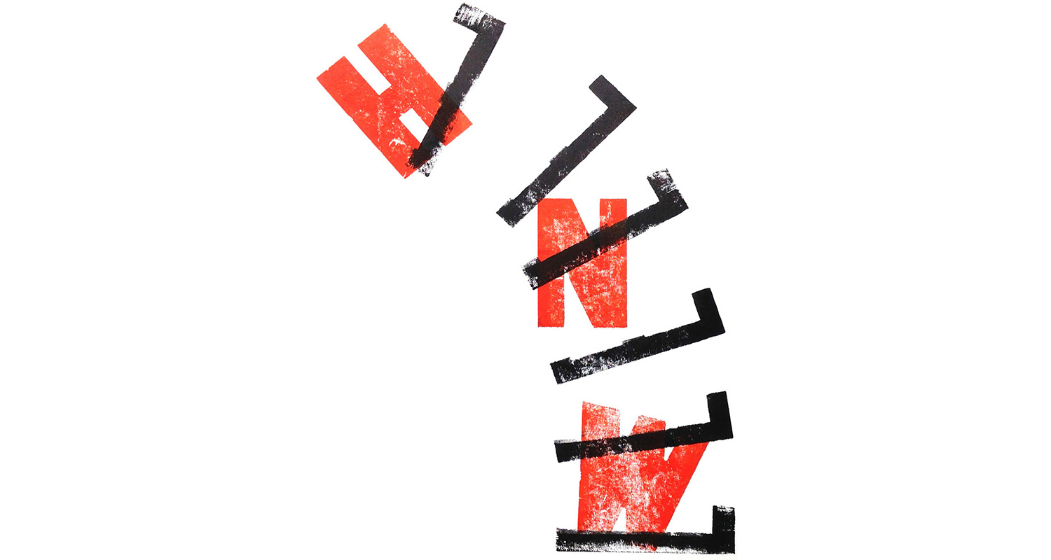
TAKE THE LID OFF of your jar of creative juices and get ready to have some colorful fun in a hurry. Kids, adults, students, and professionals all love this workshop. You're printing in the steps of H.N. Werkman, a WWII Dutch designer, and publisher who used an unusual approach to making letterpress prints, which he dubbed "druksels", a play off the Dutch word "to print."
In a book entitled H.N. Werkman by Alston Purvis, he wrote this about Werkman.
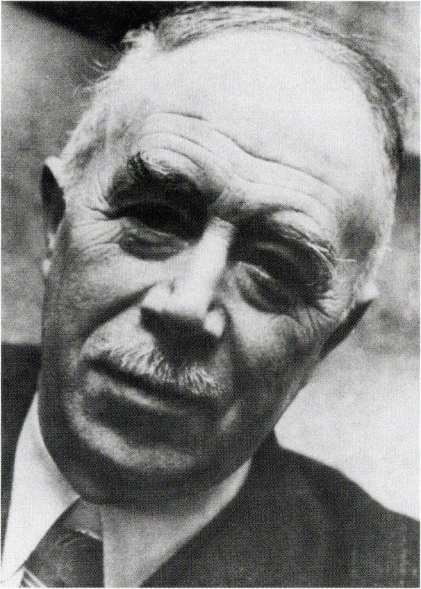
"Werkman believed that the hidden paths are the most beautiful ones. Playful innocence, a resplendent vitality and the element of surprise characterize his creations. His legacy is to teach us that type can function independently without needing to communicate a message and that graphic design need not be bound to the new technology of its time. [in his time it was offset printing, in ours it is the Internet] He showed that it is possible for graphic design to come from the heart and amount to more than craftsmanship; that it does not have to rely on systems, modes or rules; and that the human touch in design is still vital."
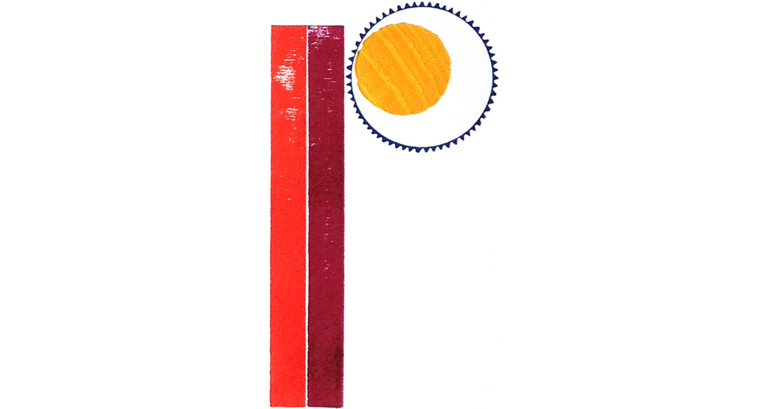
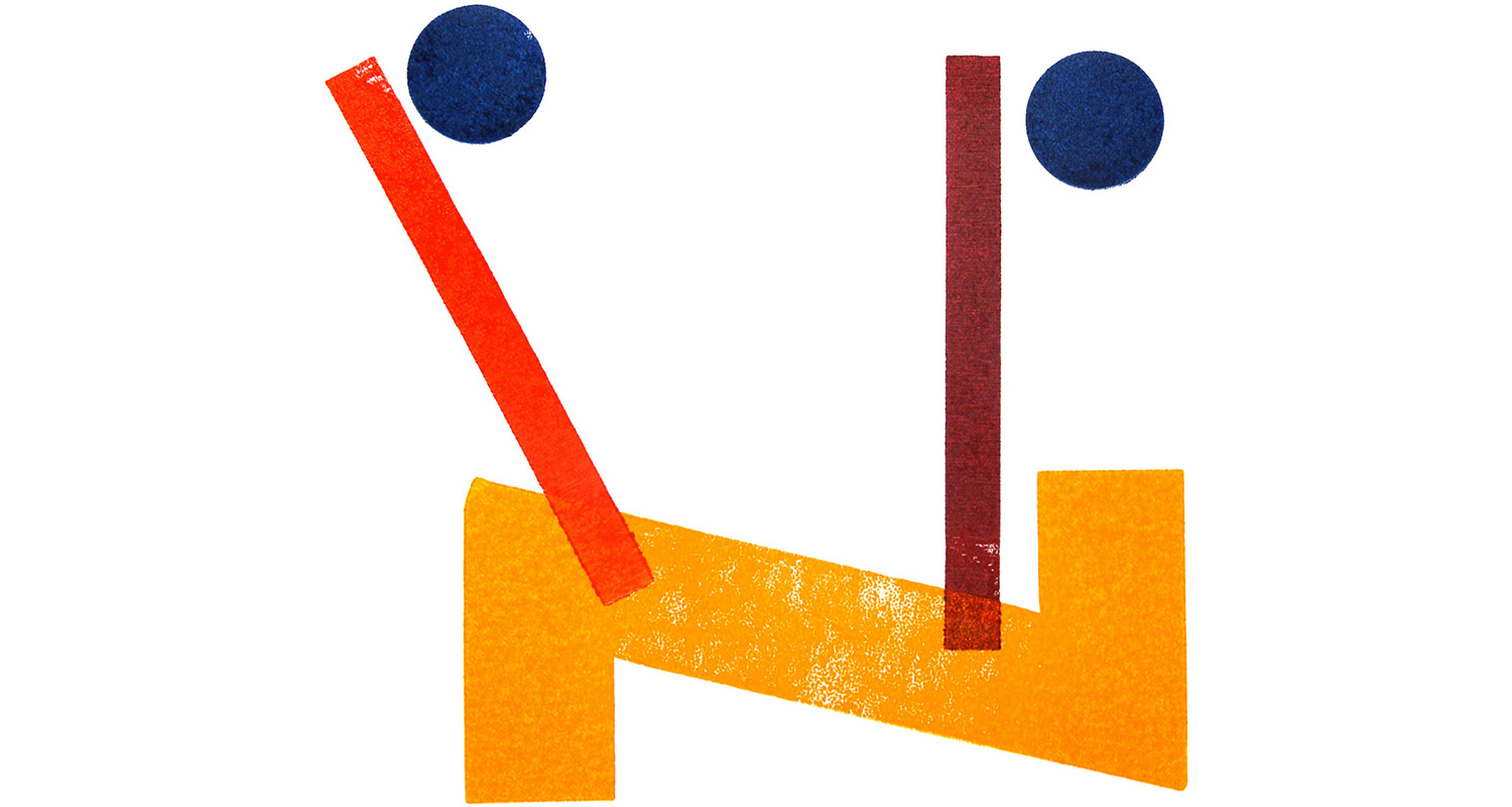
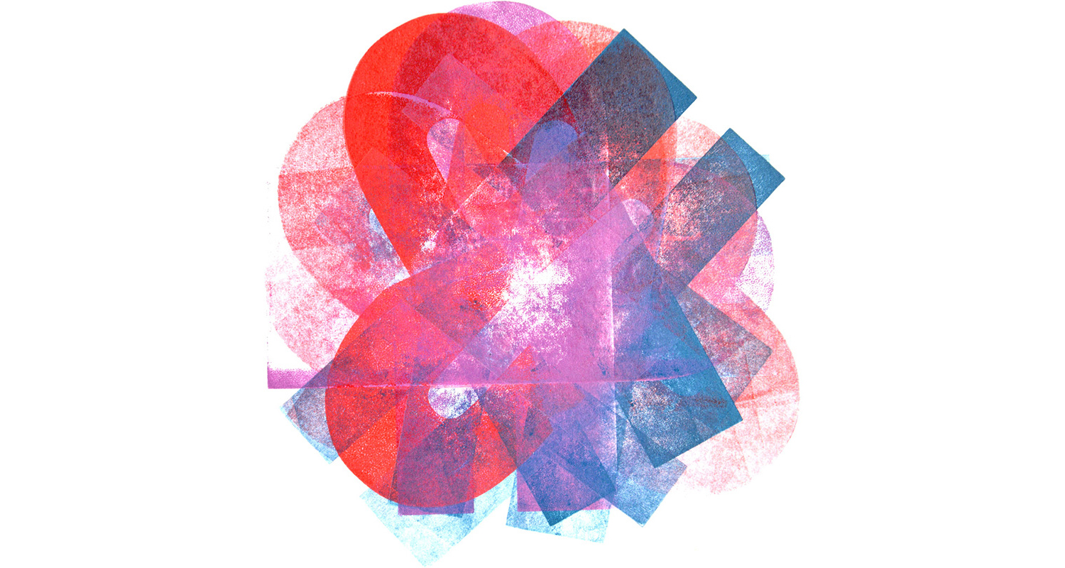
PUT YOUR IMAGINATION INTO HIGH GEAR and start with some playful hand rolling of wooden type. Set your students' brains on fire early in the semester with this visual vs. verbal design approach. Rather than spelling, think shapes, repetition, a kaleidoscope of colors, overlap and strategic placement—all done about as fast as you can ink.
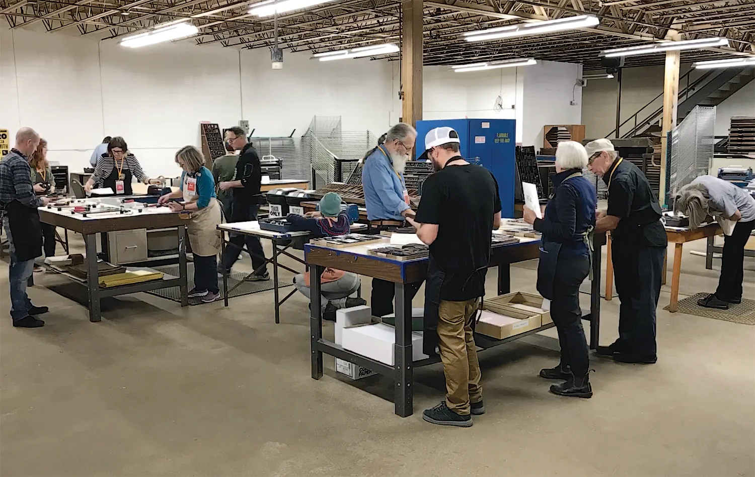
⬆ We ran 2 sold-out sessions of our H.N. Werkman Creative Letterpress workshop at the Hamilton Wood Type Museum's 2017 Wayzgoose.
Instead of printing an edition of many of the same idea, you make 1 artistic print of lots of ideas. There's no tedious measuring or letterpress lock up—just lots of doing, playing, and being creative, focusing on the shapes and interactions of letterforms.

⬆ A view of one of the satisfied groups at our Hamilton Wood Type Museum workshop.
Good to know
For 6 to 15 people, age 8 and better
$80 each
3 or 4 hours (longer opening with short studio tour) with snacks
For your workshop, wear comfy shoes (our concrete floor is hard) and work clothes (you will get dirty). Dress for the weather—we are not air-conditioned, and in winter the heat rises to the ceiling 20 feet up.
Lead Graffiti supplies all tools and materials. Be sure to bring questions, your camera, and a notebook to record your process.
Getting started
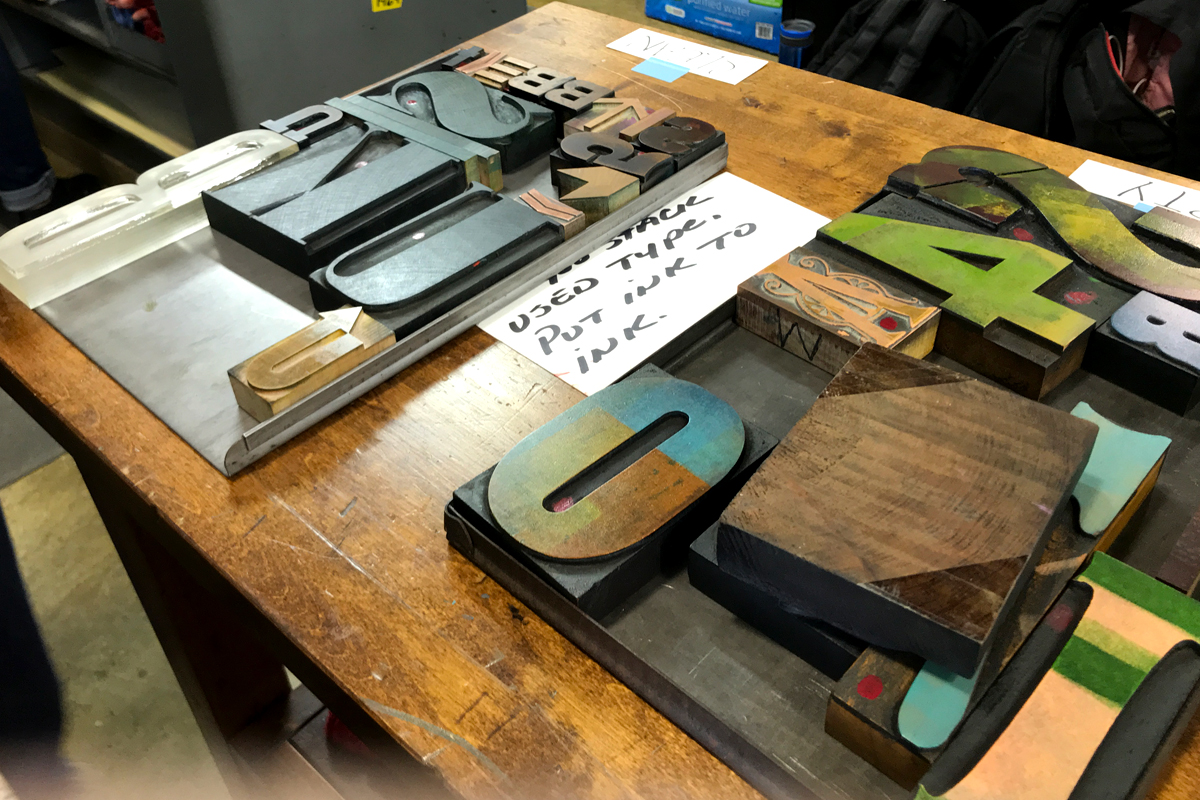
AFTER A BRIEF INTRO to Werkman the man and a look at some printed samples for kickstarting your creative flow, you're on your way. As you hand roll ink on the wood type, try to look at the letters as shapes for constructing your image, instead of seeing them only as parts of words. Lead Graffiti staff will demo the simple operation of each of the 5 presses that are available for this type of printing, and then it's time for fun. Working as quickly as you can ink, you can print on any open press as you assemble the different shapes of each of your druksel compositions.
The Werkman druksels make an off-beat and stimulating event as part of any professional business retreat. The physical act of handling dimensional type and working with it as you compose with shape and color gets those gray cells firing off in new directions. Taking this experience back to the workplace gives you a fresh perspective on handling the tough jobs, as well as the daily grind.

Some info about H.N. Werkman
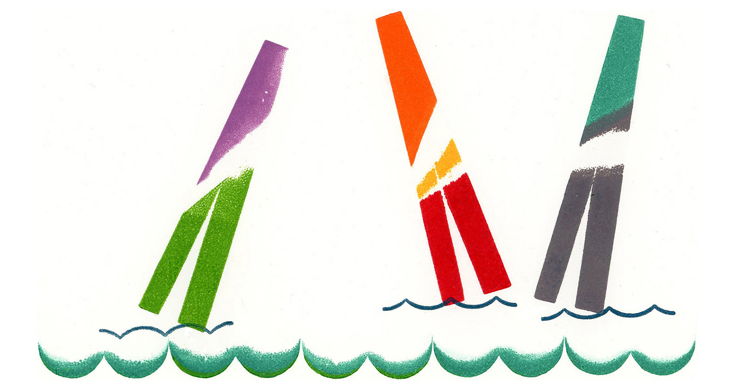
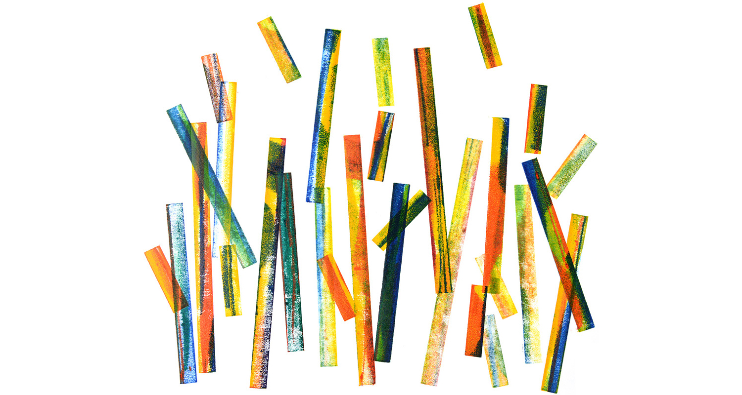
A few images from Werkman to start.
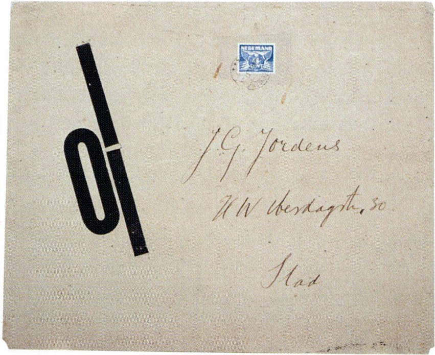
For an inexplicable reason this envelope mailed by Werkman has been a haunting image ever since we started to research his work. To simply place those typographic shapes is completely mesmerizing to us.
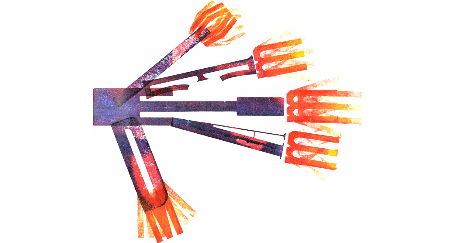
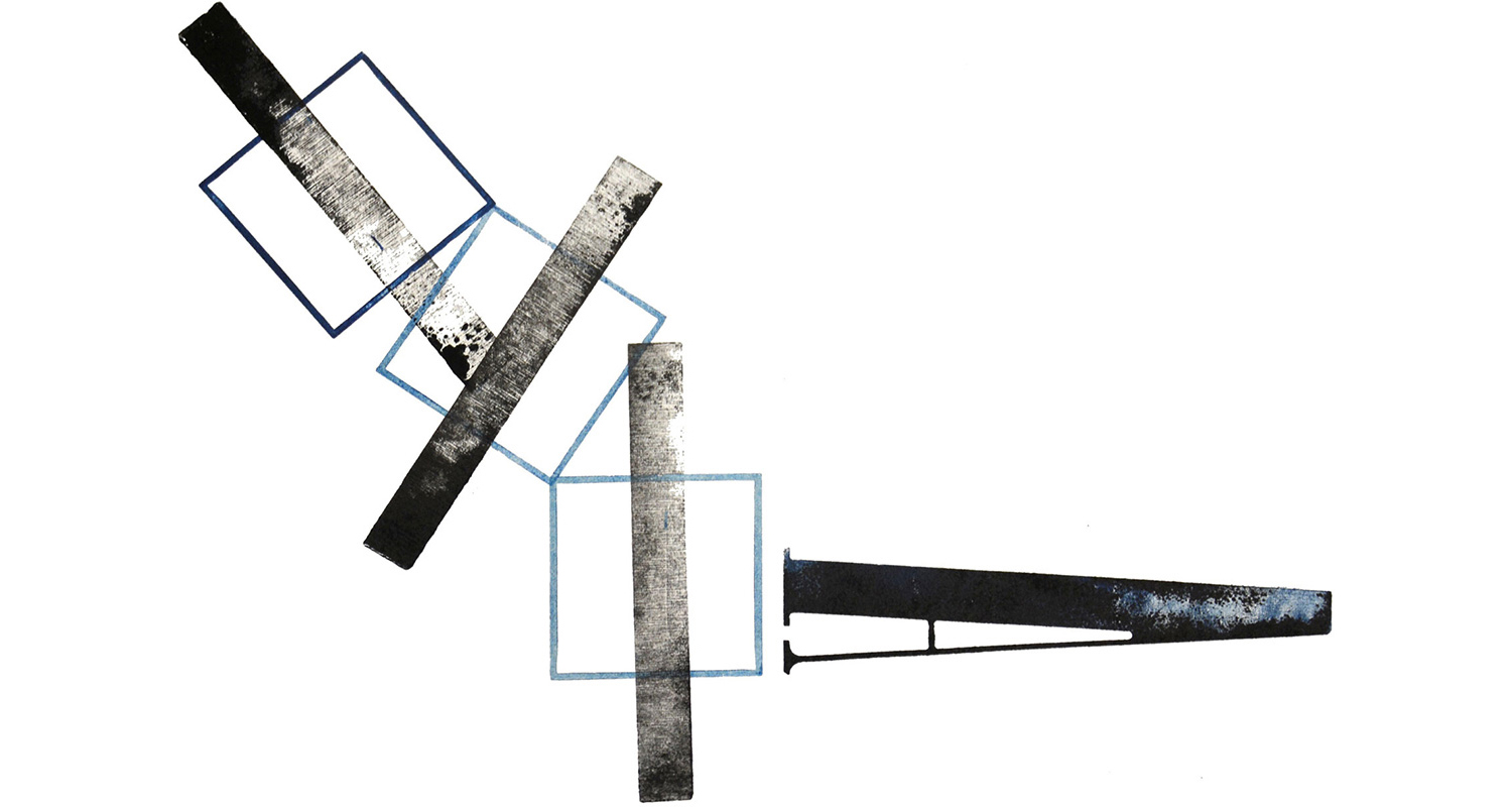
One of his major projects, The Next Call, was a set of avant-garde publications by Hendrik Werkman from September 1923 to November 1926, in which he explored typography and his experimental design language.
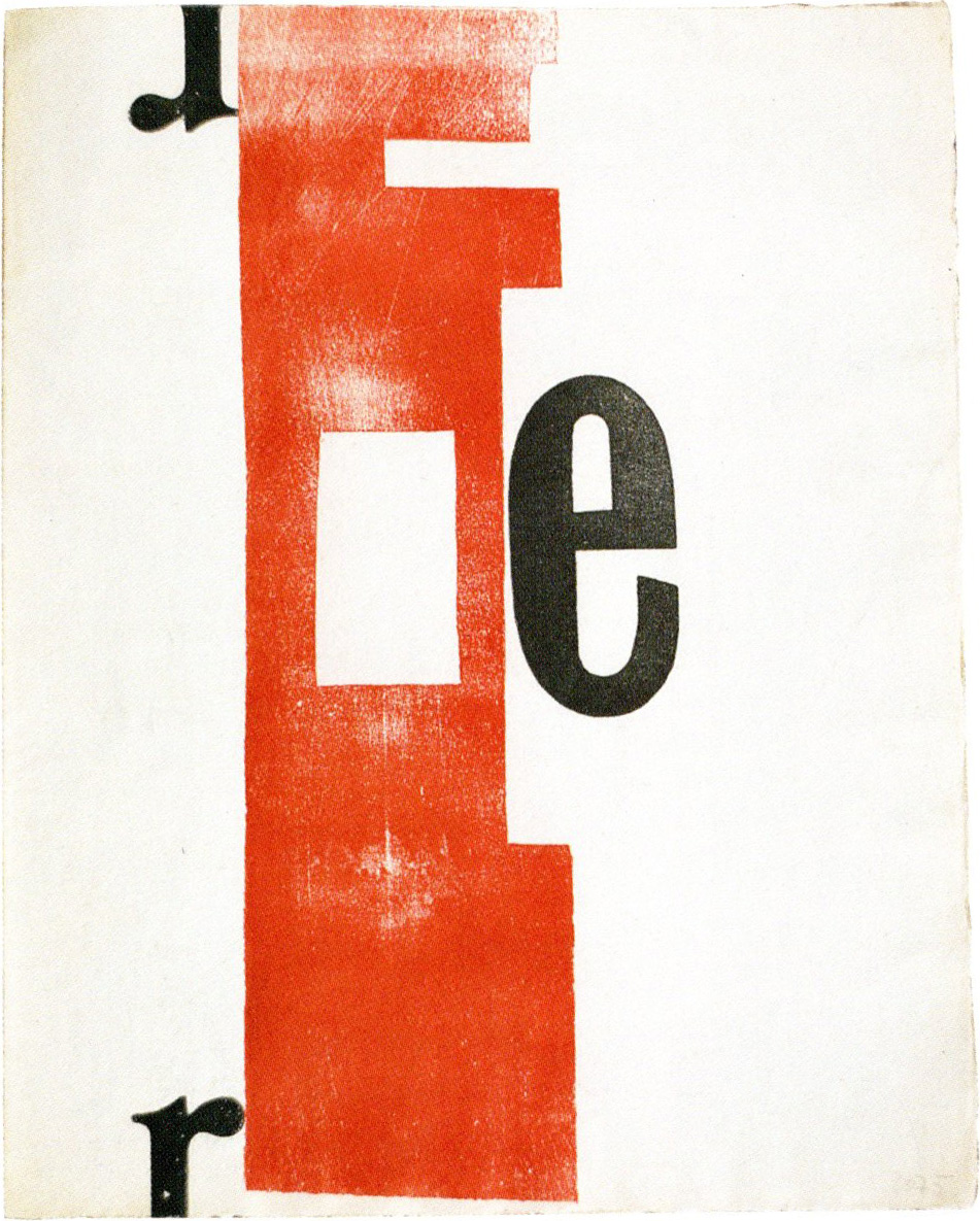
⬆ From The Next Call 1 using the lock plate off a door as a printing surface.
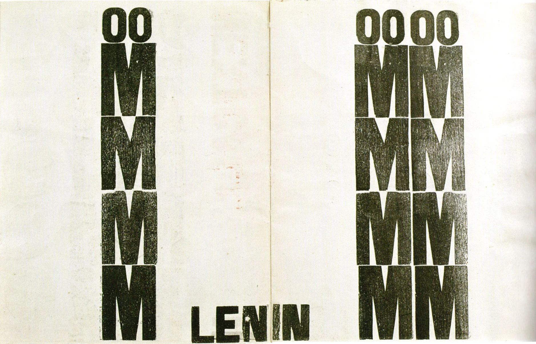
⬆ From pages 2 and 3 of The Next Call the Os and Ms suggest troops escorting the body of Lenin. It is interesting that "oom" in Dutch means "uncle," which you might weave into the visual / verbal equation.

Photos from the workshop

⬆ To get the juices flowing, these students take a look at some different inking possibilities.

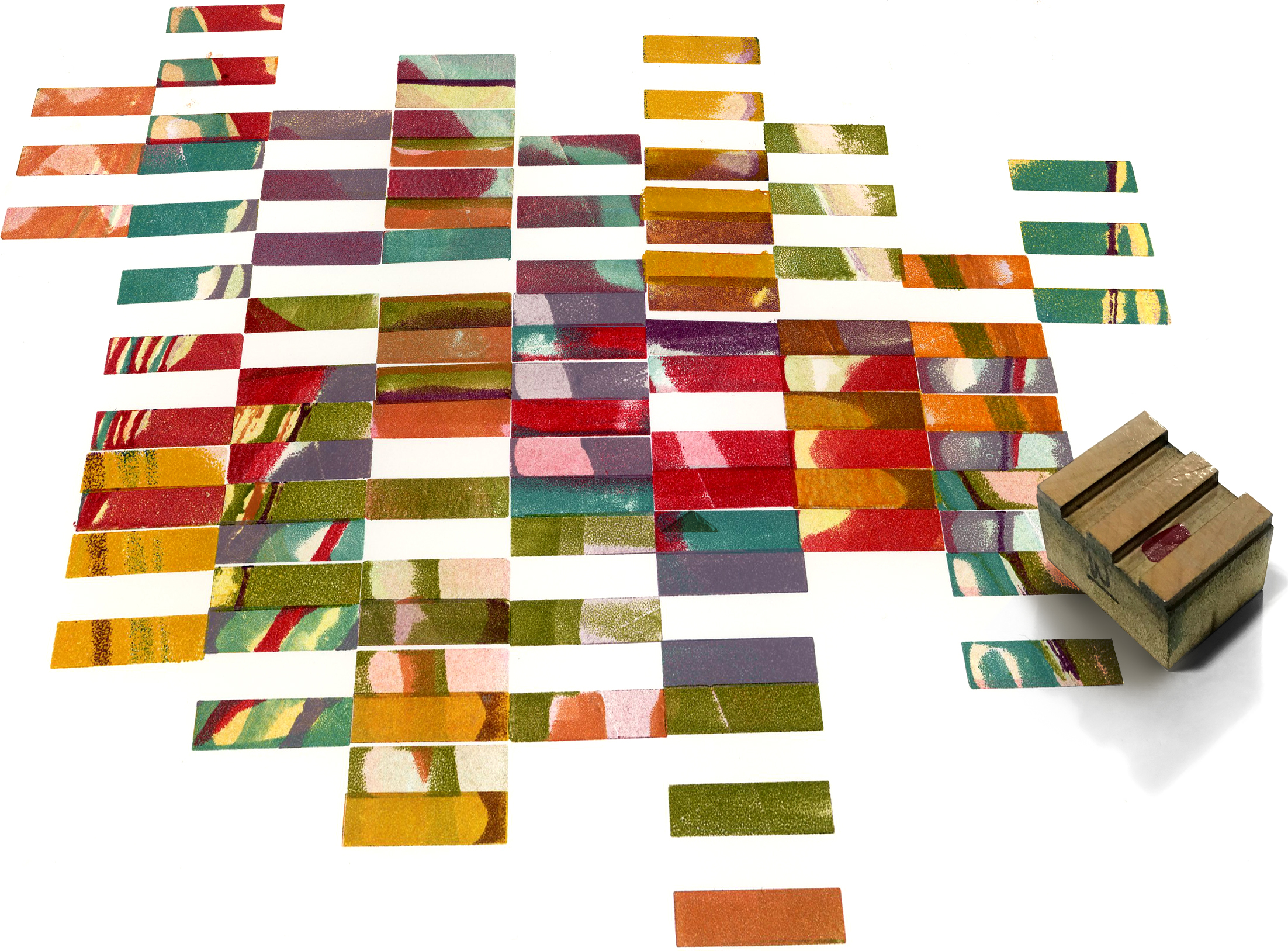
⬆ Typically we lay out 6 - 9 colors we've mixed to work together. Participants can just pull from them as they will, often inking the type with multiple colors.

⬆ Organizing directly on the press, paper up and type down, to consider fresh bits of color and a new path to explore that wasn't there a moment ago.

⬆ Organizing away from the press to help choose what letterforms and color to include next.
⬆ Letter in the left galley have been cleaned while the ones on the right are ready to clean. The staff at Lead Graffiti do all of the cleanup so the participants can stay focused on creative invention.

⬆ Hanging your druksel so you can jump onto the next one.
Below are a couple of images showing younger participants. Kids will spend hours making Werkman druksels. No phones. No iPad. No videos. Just H.N. Werkman, type, ink, and paper.

⬆ A young participant puts her best Michael Jordan english on her inking-the-type technique.

⬆ One of our younger participants working on our Vandercook SP15. We carefully instruct them in the printing process and thoughtful safety procedures and then pretty much leave them alone.
Click on the image below to cycle through a few favorites from our workshops
Some things to consider
black (or a single color) only
black and greys
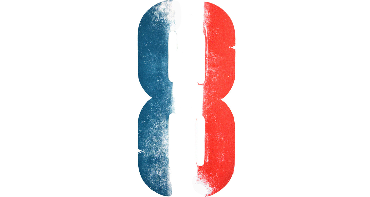
red and blue to make a political statement
fluorescent inks
work on colored paper (Canson or the like)
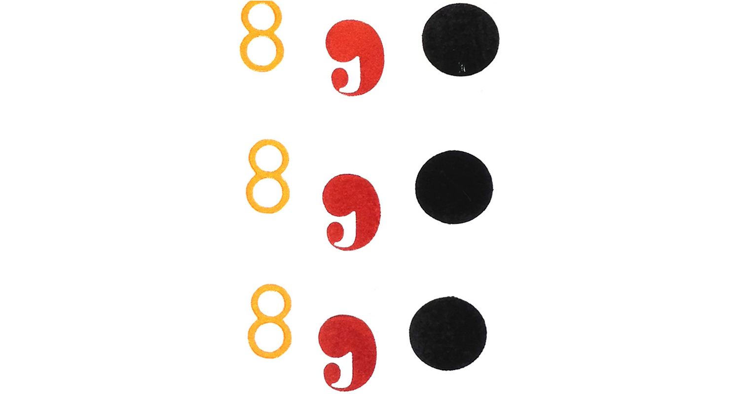
each print only uses one letter
only use one typeface but whole alphabet
work 12" x 12" to make an album cover
greeting cards
Just thinking out loud.