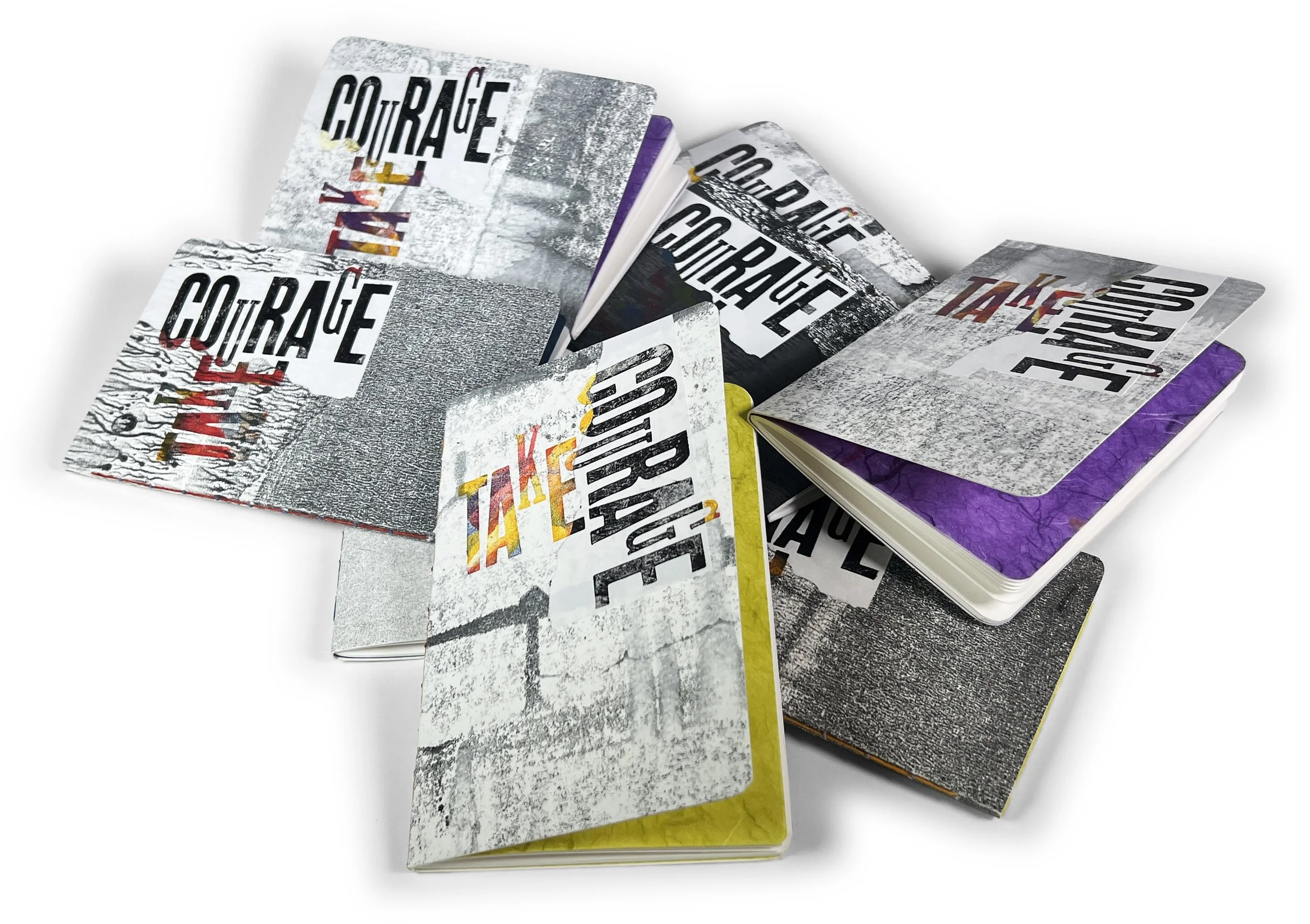
Several years ago, we made dozens of these 3.875” x 5.875” notebooks at the request of an important friend and teaching colleague, Bernie Herman. Bernie bought a couple of dozen. After that, we started calling them “Bernie Books.” He scribbled in them about all kinds of subjects, from Southern food recipes to raising oysters. Bernie passed away in December 2024. We’ve decided to reintroduce them with a few updates.
The general configuration is: they will have “ink pull” covers, a fly-sheet of various paper types, 40 inside pages of various paper stocks, and be bound with a “string-of-pearls” stitch.
They look simple. They aren’t. Here are the 28 steps required.
Cut paper from various sources for an ink pull.
Interrupt the press cleaning process to make ink pulls.
Make the ink pull (sometimes 2 layers at 2 different times).
Crop out the desired area of the ink pull for the covers.
Trim the ink pull covers to the accurate height size (final trim size).
Trim the ink pull covers to an accurate width size (they will be recut later).
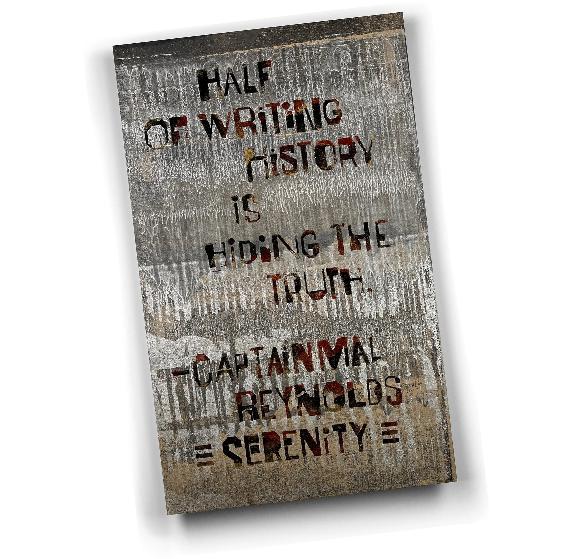
Hand roll printing plate in multiple colors and print “Take Courage” for the covers.
Handroll to create at least a slightly distressed “Courage” probably in black for the collage element to overlay “Take Courage.”.
Tear the collage element along our plastic tearing jig.
Run the collage element through the Xyron adhesive machine.
Trim the collage element on 2 sides.
Run the collage element through our Xyron machine to add adhesive to the back.
Align the collage element to the printed cover and adhere.
Retrim the top edge of the collage element to the top edge of the book.
Print the logo & book description on the inside of the cover.
Cut the inside text paper for the book.
Separately cut a flyleaf out of various options.
Fold and gather the flyleaf & 10 folios for each book.
Capacity score & soft fold the cover for the book.
Punch 11 holes in the text block’s spine (separately to center accurately).
Punch 11 holes in the cover.
Measure thread and thread two needles.
Using the “String-of-Pearls” stitch, bind the textblock to the cover / 15 minutes each.
Trim the fore-edges of a couple of books at a time.
Round the fore-edge corners.
Photograph, crop, & adjust a digital image of each book for the website. Critically important as the buyer is purchasing a specific copy with a specific look to the ink pulls.
Add a book-number label to each book.
Insert the book & number into a clearbag.
Crop & add an entry for each to show its exact look on LeadGraffiti.com website.