The three paragraphs below are from the website of Chris Fritton, The Itinerant Printer outlinined his Kickstarter Project which in the summer of 2018 will result in a serious book on letterpress stories across the United States.
The Itinerant Printer visited more than 150 letterpress printshops across America throughout 2015-2017, producing unique prints at each venue culled from their collections of wood type, metal type, cuts, ornaments, and polymer plates. These prints will be mailed back to followers and supporters of the project as postcards (and care packages) from the road.
The project intends to capture the spirit of the analog revival, send real samples of it into people’s mailboxes, and convey the ethos of the handmade to a broader audience via social media, and as a culmination, result in a coffee table book that features photos all of the prints, print shops, and people from the adventure.
It is also about reviving that sense of adventure in printing, along with the analog sharing of information. It’s about going out into the world, seeking work based on your skill set, making something with your hands, and delivering that object to someone. It’s about an exchange of ideas, of techniques, of information, of style, and of the consummation of all those things: prints.
And this is the text for the story about Chris' week he spent at Lead Graffiti.
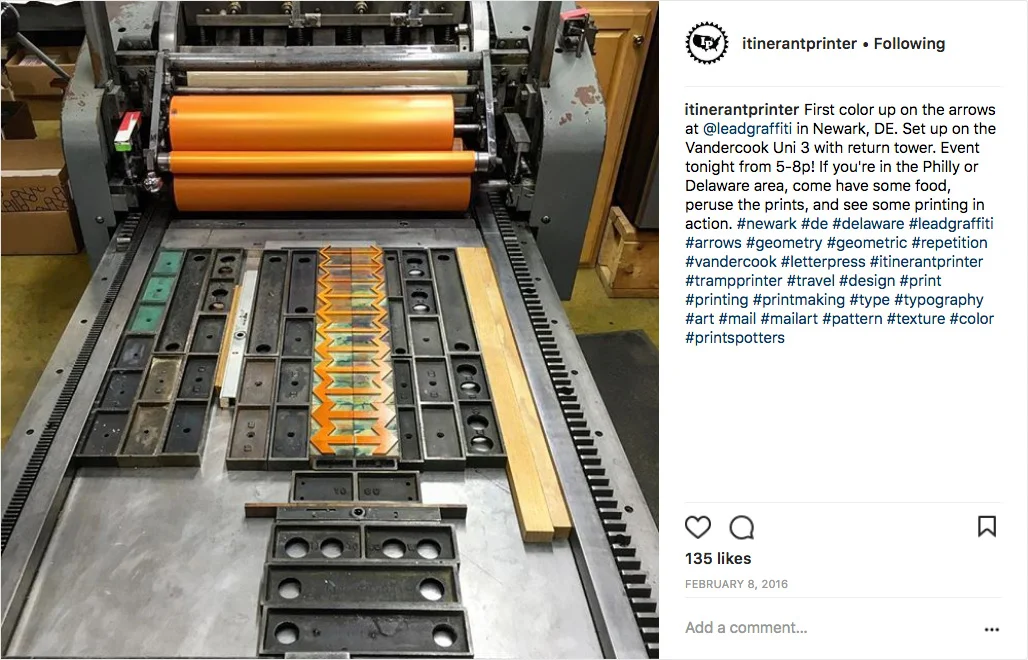
In a faceless corrugated steel warehouse in an industrial park just outside Newark, DE lies one of the most experimental letterpress shops in America, and doubtless, the world: Lead Graffiti. LG is the incorrigible, unpredictable, and uncompromising brainchild of Ray Nichols and Jill Cypher — a shop where the only rule is there are no design rules, and the thing you learn every day is that there’s always more to learn.
I’d never met Ray & Jill, but after looking at their work, I figured we’d get along just fine. It’s abstract; it’s expressionistic, it eschews the grid in favor of random orientation and welcomes chance as an aspect of printing to be embraced, not eradicated. Their prints are asymmetrical & erratic, full of provocative color choices & typographical anomalies; they are the index of playful imaginings, open systems, and hopeful dreams. They print with anything, continually testing materials that yield results with varying degrees of success, partnering those aberrations with traditional wood type, metal type, border, and ornament. Their collection is vast & varied and boasts hundreds of cases of type, proofing presses, platen presses, hand presses, an Intertype machine, and more — a lifetime’s worth of toys to play with spread across 2,200 square feet of cold concrete. I asked Ray when it all started, and he described having a “moment of clarity” in 2001 after visiting Alan Kitching’s studio and the St. Bride Foundation in London. He described it as an “aha moment” when he realized that he “should spend the rest of his creative life working with letterpress.” Although he took early retirement and started to chase his dream almost immediately, Lead Graffiti wasn’t officially born until 2008.
I hunted through the cases as Ray entertained me with tales of where it all came from, and I took photos as he showed me their favorite prints. Some of the most significant achievements, in my opinion, are the prints from the Tour de Lead Graffiti series. From 2011-2015, in correspondence with the Tour de France, Ray & Jill (and occasionally a few others) would watch the day’s race, look for usable elements & notable events, go to lunch to mull it over, then spend the whole evening translating that leg into a multi-color poster. They referred to it as “endurance letterpress,” and that it was — to crank out 3, 4, and 5-color prints every night for 3 weeks, crafting a brand new design from scratch every time. The prints are visually staggering, incorporating wood type, metal type, random materials, and sometimes even bicycle parts; they integrate hand-inking and other elements that (even though they’re a “series”) guarantee they’re all closer to one-of-a-kind. They painstakingly recorded all their work, and it’s indexed online with photographs of the methods of production, recaps of the races, and more. The work still wasn’t over, however, as each series was turned into a boxed set for sale. I’d done meticulous, time-consuming printing before, but I’d never seen anything like that.
Ray loves to talk, and we had plenty of time for talking — we’d go out to lunch each day, chat about our histories, our futures, and printing. He has a background in graphic design & commercial advertising, and he taught at the University of Delaware, where he and Bill Deering established Raven Press, a letterpress shop for student & faculty use. Jill comes from a design & advertising background as well. Based on their work at Lead Graffiti, they were most interested in, as you might imagine, the more oblique pieces that I’d been making on the road — getting off the grid to a certain degree, but they were already good at that. This led us on to the ink wipe prints that I’d been doing: full abstract expressionism, using the letterpress machine as a paintbrush, creating unrepeatable prints, each and every one an experiment. Our conversations got me thinking about letterpress printers as fine artists, and where the line gets drawn, and where the crossover lies. It’s almost always been a technology strictly tied to the mechanical reproduction of information, but what happens when we step outside of that? That’s where the future of letterpress lies, when a medium so strictly tied to the letterform and literal information breaks away and pursues the aesthetic image, the mark-making, as an end in itself. I laughed at how comical it was, three ordinary-looking idealists waxing philosophical in a booth at The Glass Kitchen, contemplating what’s next for modern letterpress. No one would’ve ever known what lofty conversations we were having.
When we left lunch one day, Ray drove me to see a marker for the Mason-Dixon line, often seen as the symbolic delineation between the North & the South in the US. When we arrived, I found nothing more than a small stone, like an old horse-hitch, settled sideways on the side of the road near someone’s house. I looked from one side to the other, from the “North” to the “South” and could see no difference at all. The boundaries between things are often arbitrary, but standing there, it felt so clear. There was no lake, no river, no fence, nothing to indicate a borderline. And the rest of our conversation came clear at that moment too: sure, there’s a difference between different kinds of letterpress, and sure they can be demarcated and discussed. Over time those boundaries will move, and slide and the markers will tumble and dissolve, and we’ll be left with new markers and a “new” landscape, but the same old debate. Because it’s not the markers that matter, or even the landscape itself, it’s the conversation you have about them.
Chris is continuously adding his story through social media. We wanted to be sure to lock his Instagram images on our website.