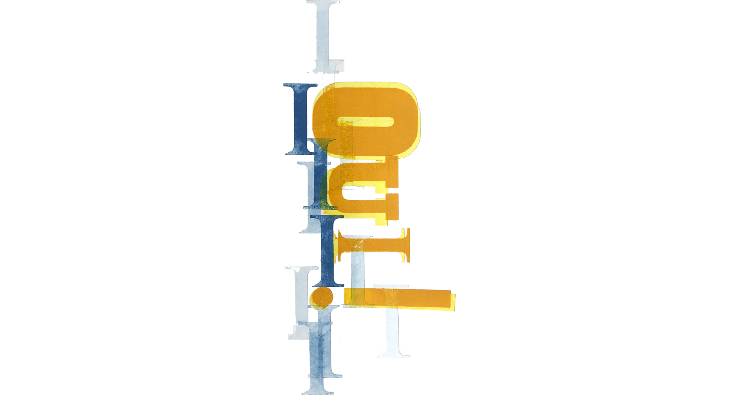
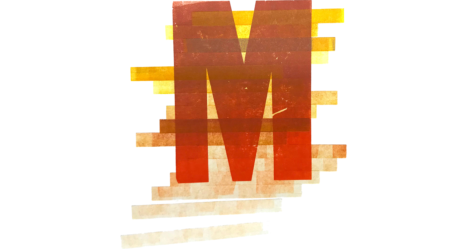
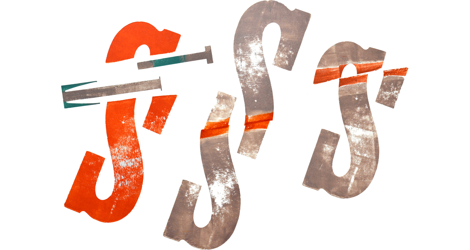
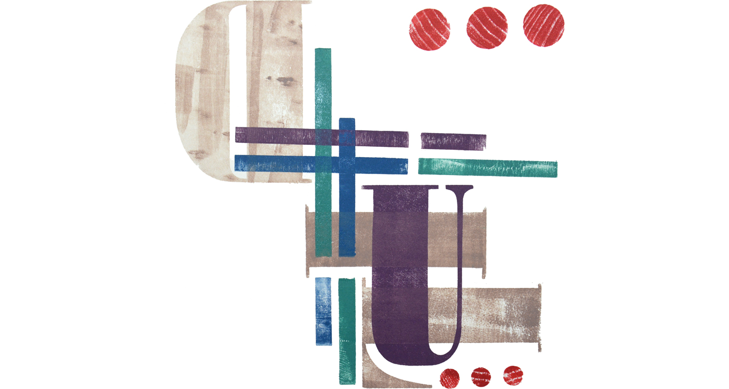
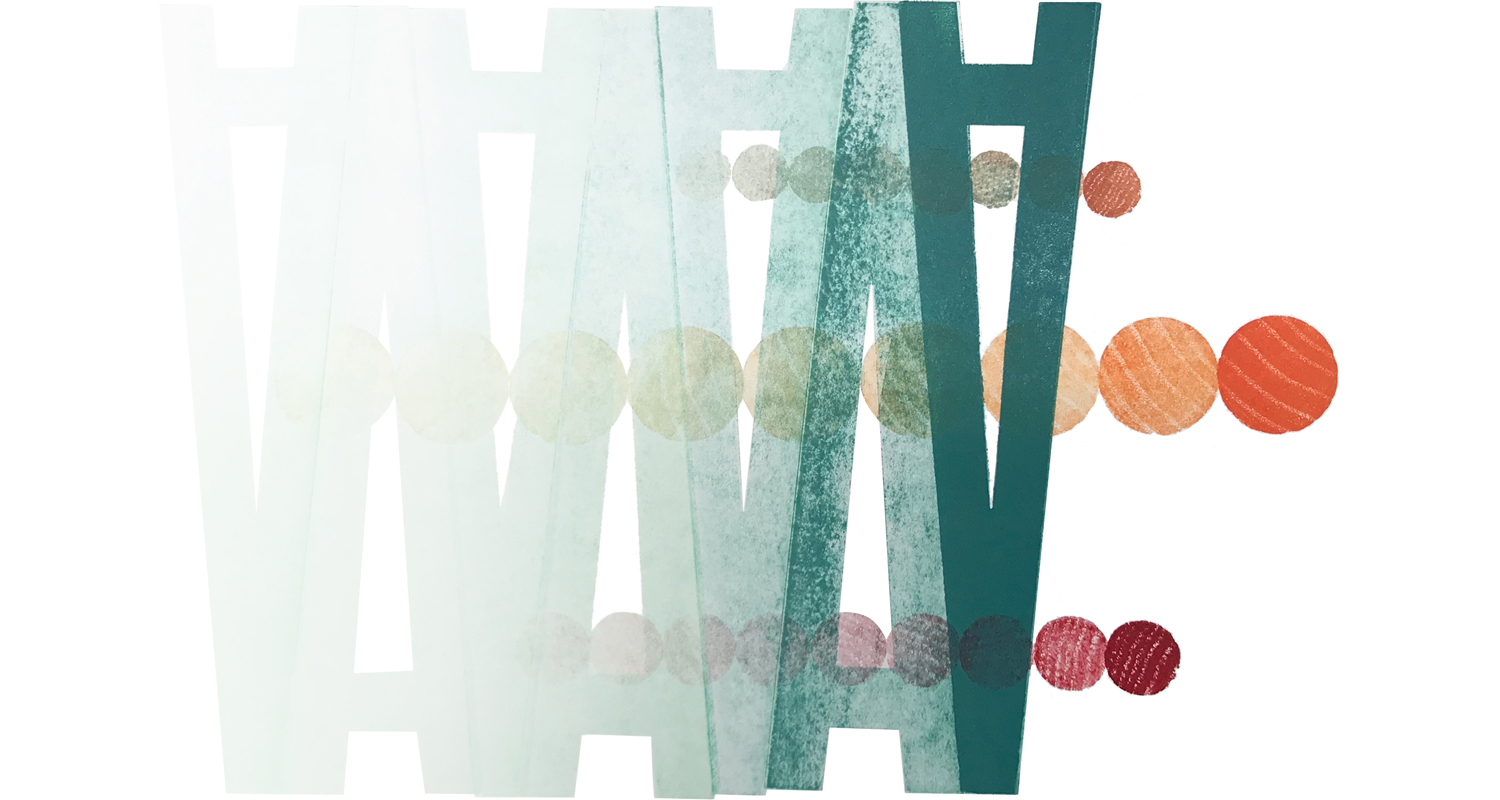
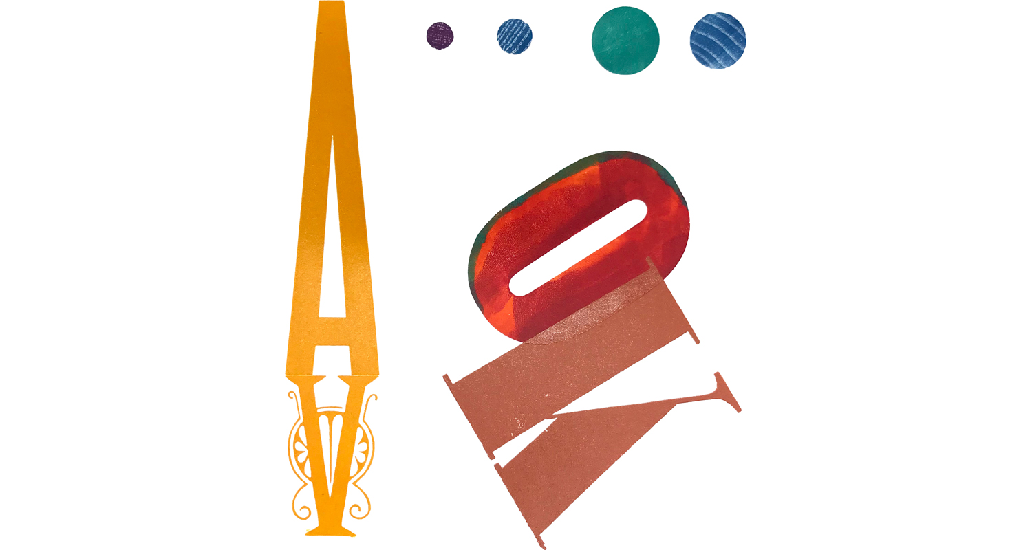
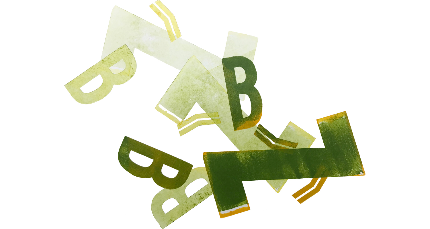
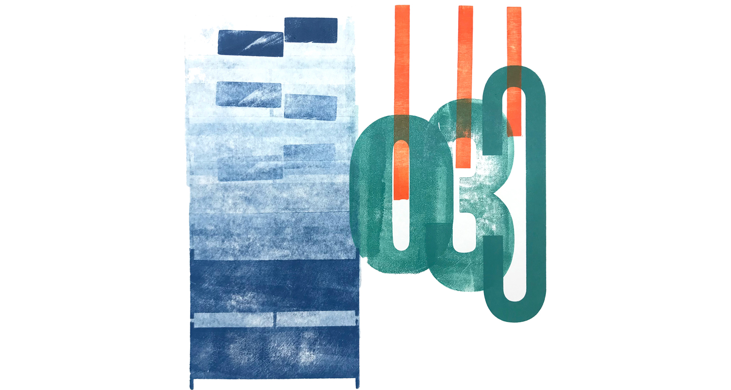
Click on the image above to cycle through about a dozen that we picked out to highlight.
A group of graduate students taking a class in Digital Tools at Drexel University in Philadelphia, under the tutelage of Diane Zatz, wanted a field trip and chose a Father's Day Werkman workshop at Lead Graffiti for the experience.
With our new website run through Squarespace, a sweet and reasonably easy function is to create a carousel of images. So, we are going to try it for each workshop with up to maybe 20 images.
A WORD ABOUT US CHOOSING IMAGES. We've looked at a thousand of these things and more than anything we like typographic ideas and not just a "pretty" piece. The point of the workshop is typographic experimentation and mainly that is what we look for.
some way of using type we haven't seen before
some are chosen because there is small area we like (we call that part of the image a "nugget," a term we borrowed from Martha Carothers, and it may only be a square inch)
an amusing, curious, or thought-provoking juxtaposition of shapes
an unusual way of repeating the same element
imagining that it could make an interesting initial cap for a magazine article
would stand out on a book jacket
just an idea to put on your shelf to pull down at a later time.

