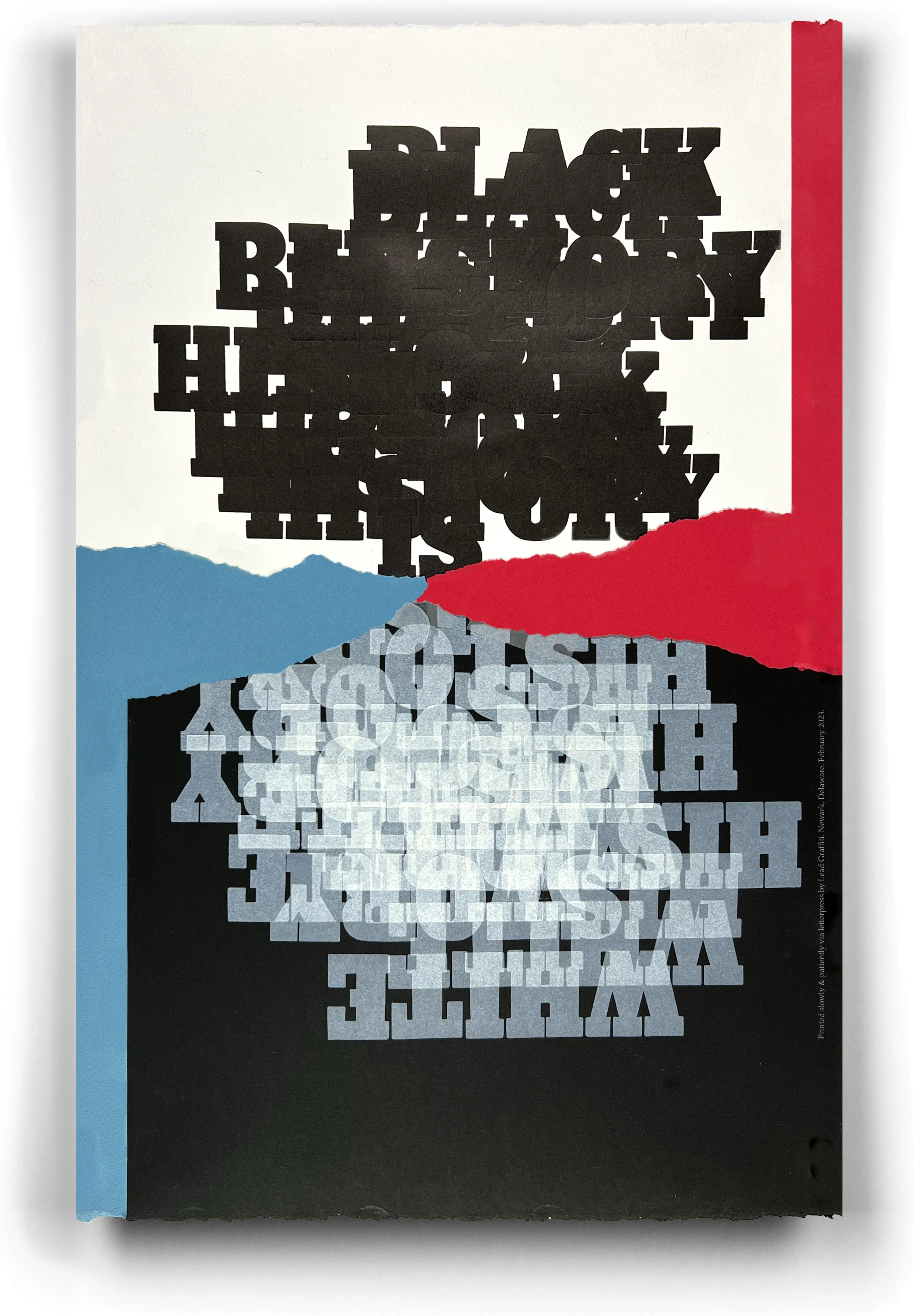
Category : broadside
Paper: White / Somerset Textured white 300 gsm, Black / French 140#, adhered to an unknown adhesive-backed sheet we’ve had for 20 years, Color / Canson Red & Royal Blue.
Type : hand-set wood type (black), photopolymer (white & credit line)
Runs : 13 (6 for black, 7 for white with credit line)
Edition : 12
Press: Vandercook Universal III for all runs
Black History Month was the original impetus for an Afternoon Diversion project. We’ve begun quietly posting Afternoon Diversion printing times on our studio calendar on our website. It works about as well, generally, as you would think. Originally intended to attract students who want to try letterpress, we treat them as Vandercook (sometimes an iron hand press) workshops. Melissa, a former student with letterpress experience, didn’t surprise me by jumping on board.
I (Ray) have become obsessed with using a 10-line Antique Extra Bold wood type we recently bought from the Mike Denker Collection. This project started as a vague (we love it when they start like that and turn into something cool) idea after reading Elie Mystal’s book entitled, Allow Me to Retort, which has somewhat shattered my feelings toward my pre-college education which is adding to the troubling news of the conservative attempt to severely limit subjects that can be taught, most notably in Florida.
The book, which explains the constitution and its history from the view of a Black provocateur, has significantly altered my white picture of the U.S. Constitution and the merit of our country’s founders.
I think I learn things in “whole block” pieces, bricks of information that may build a wall, but the bricks and the wall tend to be “separate but equal” things. I came out of Elie’s book with the uncomfortable feeling that I had been living that my history was mine and their history was theirs when all of the blocks should have built an “our history” wall.
Hence, BLACK HISTORY IS WHITE HISTORY.
I mentioned the “vague idea” earlier. I had no idea how this would fit together, if it would fit together at all. Black ink on white paper (✔). White ink on black paper (✔). Both are saying essentially the same thing. As a printing technicality, the two inks didn’t work the same on the two papers. The black ink is solid & opaque (✔). The white is transparent (✔). No way those will work on the same color paper (✔). Printing multiple times will disrupt the reading clarity (✔). Repeat the words to drive the idea home (✔). Spend twice as much on paper (✔). Make placing the terms difficult, so you ruin a lot of sheets (✔). Now we are talking. And we’ve dragged a new HTML character ✔✔✔✔✔ into our options. I must figure out how to merge the 2 sheets (✔). Hmmm. Collage (✔). Tear the white & black paper in half (✔). Add some color (✔). Red (✔). Blue (✔). The tearing fits rather nicely as a design element (✔).
This was the first broadside I’d put together, and it has some problems right in the middle where you would hopefully see the black “is” and a white “is” better. I’ll work on getting those to work together better in the rest of the prints. Now, how do I get the broadside to Elie Mystal?

