

WHEN I WAS TEACHING CREATIVE THINKING and trying to give my students some incentive, I would often raise the question “What would a good student do? Right here. Right now.” to try to multiply a simple opportunity into a small miracle.
Read moreDoves Press type : metal & digital

Possessing a copy of Genesis 1:1 from the Dove's Bible adds an element of obsession on our part to the Doves type that was used to print it.
Read morePaul Renner's spacing for Futura

It occurred to us that it might be interesting to buy Die Kunst Der Typographie and see how Paul Renner would use his own typeface, Futura. I did buy it. You can see that the letterspacing is wide letterspacing is incredibly wide by today's standards.
Read moreWhat makes Lead Graffiti so hot?

At Lead Graffiti we are extremely fortunate to have invested in the purchase of an Intertype C4 linecaster. It adds significantly to the historical value of our collection as well allowing us to offer a first-hand experience with "hot metal" type for participants in some of our workshops.
Read moreLaboratory Press : metal type composition the old-fashioned way

DO YOU TEACH TYPOGRAPHY? Here is a project you should give twice. The first time during the first week of the semester. The second time during the last week.
Read moreEverything the same, but different

We hated working for a client who came armed with a logo and an accompanying design manual dictating specific color options for both the logo and the corresponding background, how close images could occur to the logo, etc.
Read moreYear-End Show posters from Visual Communications
I stumble across printed samples and photos of some work that was part of my life back in my Visual Communications days. One of the perks that came from being a designer working for clients and doing a lot of printing work (and I tended to work with only 1 or 2 printers) was that I could leverage those printers into printing VC stuff for free.

Year-End Show poster / 1979
If there was a creative moment that I personally started to think that the design program could have national recognition it was with this piece. It was the copy more than the design of the piece. The text which I wrote on the bus coming back from a New York field trip. This is where the idea of the review process to get into the program originated. The text reads...
In the beginning there are 60 sophomores.
They come as designers, illustrators
typographers and design consultants.
It was more difficult than they imagined.
These sophomores are still with us.
The 60 become 30.
Those that leave, leave for a number
of reasons: the work, the field,
the pressure, just to do something else.
Those that stay, stay for the same reasons.
These juniors are still with us.
The 30 become 15.
The reasons are still the same
but the reward becomes greater.
The excitement of the field becomes
a part of their work.
Finally they become the designers, illustrators,
typographers and design consultants they
thought they started as.
These are the seniors that have stayed.
"A Swarm of Bs" book & keepsake
One of the things we always say to say to students is that if they are interested in letterpress (or honestly just interested in design), they need to find real projects they can do for real people. This was one of those we could have just as easily not done.
Read morePorter Garnett 10 commandments for craftsmen
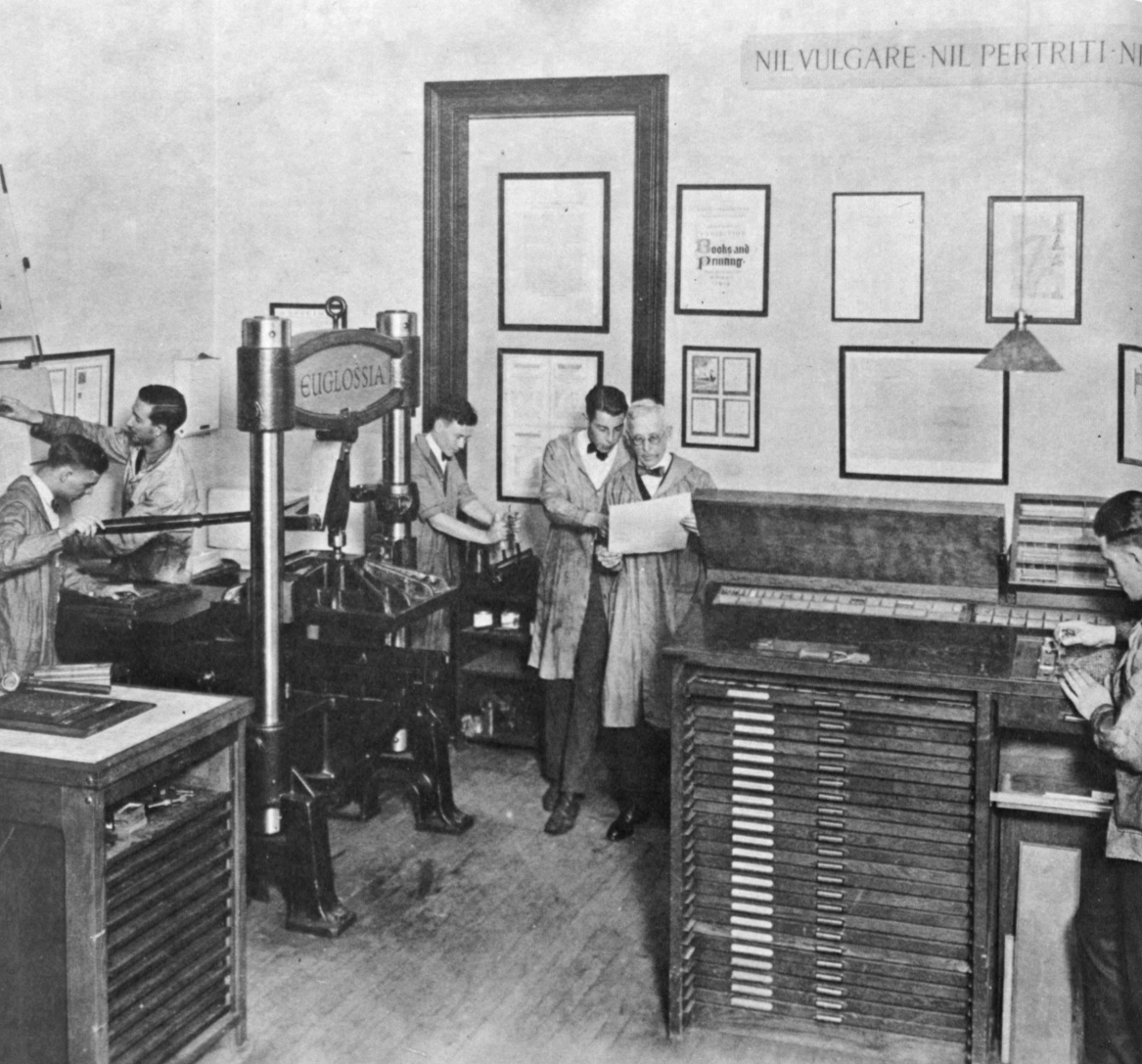
After finding our Harrild & Sons Albion iron hand press had been part of Laboratory Press at the Carnegie Institute of Technology back in the 1920s, we recently visited the Hunt Library at Carnegie Mellon University to see some of the things printed back in the day.
Porter Garnett who initiated the fine press program at CIT wrote out these 10 commandments printed in a small booklet printed at the New Laboratory Press, College of Fine Arts, Carnegie Institute of Technology. Handset in Hunt Roman, a type designed by Hermann Zapf, Printed 18 June 1963.
. . .
DECALOGUE FOR CRAFTSMEN
by Porter Garnett of the Laboratory Press
Thou shalt not imitate.
Thou shalt not cater.
Thou shalt not seek effectiveness for its own sake
Thou shalt not seek novelty for its own sake.
Thou shalt not employ expedients.
Thou shalt not exploit thyself nor suffer thyself to be exploited by others.
Thou shalt not concern thyself with the opinions of any but the sensitive and the informed.
Thou shalt not give to anyone the thing he wants unless for thyself the thing that he wants is right.
Thou shalt not compromise with popular taste or with fashion nor with machinery nor with the desire of gain.
Thou shalt not be satisfied — ever.
Art Directors Club of New York's Grandmasters Award
I’m not sure I ever saw the Art Directors Club of New York annual which announced the inaugural awarding of the title of Grandmasters to design instructors. At this point I had retired and had quit adding the books to my collection. I was Googling something and the article suddenly appeared. I looked up the book on Abebooks.com and there were copies easily available, so I bought two of them—one was for DCAD, who received a good number of the design books from my library, and the other was for Lead Graffiti’s library. I thought I would share the wonderful page designed for ADC88 back in 2009.
Nine of my absolute favorite projects ever along with my favorite portrait were shown on the double-page spread. Truly a great honor.
From upper left clockwise:
Rethinking 2009 — This was the first notion we had of doing our Boxcards using recycled boxes as the stock.
Histories of Newark: 1758-2008 — A 300-page hardback which we designed. We also took hundreds of photos for the book, most notably the “citizens band” that runs through every page and includes more than 3,700 townspeople.
All preservation is merely theoretical if you can’t keep the roof from leaking. poster for the American Printing History Association’s national conference at Columbia University. A copy was given to every attendee. The type is from our orphan wood type collection.
Can you have too much good typography — The poster celebrated a visit and talk by Justin Howes from London about his digitizing Caslon from original printings. The image is a single piece of 18″ x 24″ wood type that we made for the poster.
Think Small. Again. — Poster for a Visual Communications year-end exhibition reflecting back on the 25th anniversary of Volkswagen’s “Think small” ad. It was included in an exhibition of Volkswagen advertising at The One Club in New York.
Don’t let another art director beat you to the punch — This poster was the tipping point for my own feeling that I could complete on an equal level with other people and schools which I had envied from afar. Mounted in the Art Directors Club of New York exhibition on the same panel as one of Stephen Frykholm’s Herman Miller barbeque chicken picnic poster.
Yes 2005 — Poster printed via letterpress for a Visual Communications year-end exhibition. There are 11 pieces cut with a laser from a 1/4″ sheet of Plexiglas.
On October 5 we fished all day but didn’t catch the big one — Poster directed toward Saul Bass who called us about the piece.
The whole world is talking — The 3 versions of an 8-foot poster silkscreened in 2′ segments of voice bubbles for a Visual Communications year-end exhibition. Printed on a roll of paper 0.7 of a mile long. The stacked posters were handcut (total length was 2.8 miles). There were 36,000 rubber stamped impressions. Yes, it was a job, but a killer piece that won us a bunch of design awards.
Everyone of those is a nice moment in my life and reminds me how good a run I had with a bunch of amazing students, friends, and design professionals.