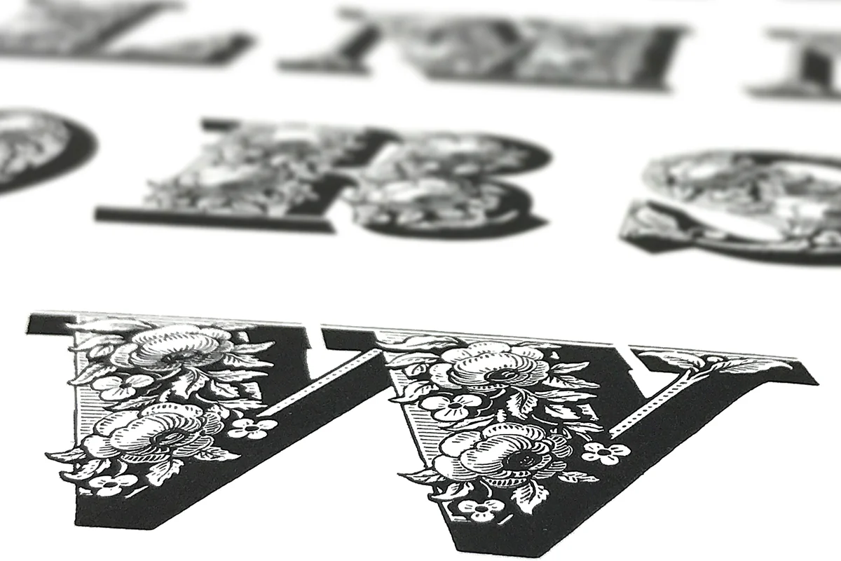
Above, you see Ian Mortimer telling Ornamented Types stories while walking us through the book. On our visit to St. Brides Printing Library, they pulled out several wood-engraved pieces, and they were stunning.
Our first studio space is unfulfilled
In 2006 I retired from teaching, and we started collecting equipment and letterpress type again for a new studio under the name “Wallflowers Press.” In February 2007, we signed a lease for a 1,000 square foot space in a new building to start our letterpress studio.
Our first iron hand press
an R. Hoe Washington #5
In July 2007, Scott Wilson, an owner of a used bookstore in Portland, Maine, placed a note in the LetPress listserv about his interest in selling his Washington #5 iron hand press for $3,000. I wrote him immediately and offered to buy it.
Using Mike Kaylor’s pick-up truck and trailer, Jill and I were set to drive to Portland, Maine, to pick it up with thirty $100 bills in Jill’s purse. We decided to stop in North Andover, MA, for the night to get up the next day and visit the Museum of Printing. We would then drive to Portland and pick up the Washington iron hand press the following day.
At the Museum of Printing in North Andover, we met Gardner LePoer, whose collection made up the bulk of the museum. We didn’t realize we were talking to “the collector” when we started, but that was a critical event in this story. We asked a hundred questions. Finally, he asked, “Want to see the attic?” Of course, we did, so he took us through there, and we asked a hundred more questions. Finally, he asked, “Want to see the basement.” Of course, we did, so he took us through there, and we asked a hundred more questions.
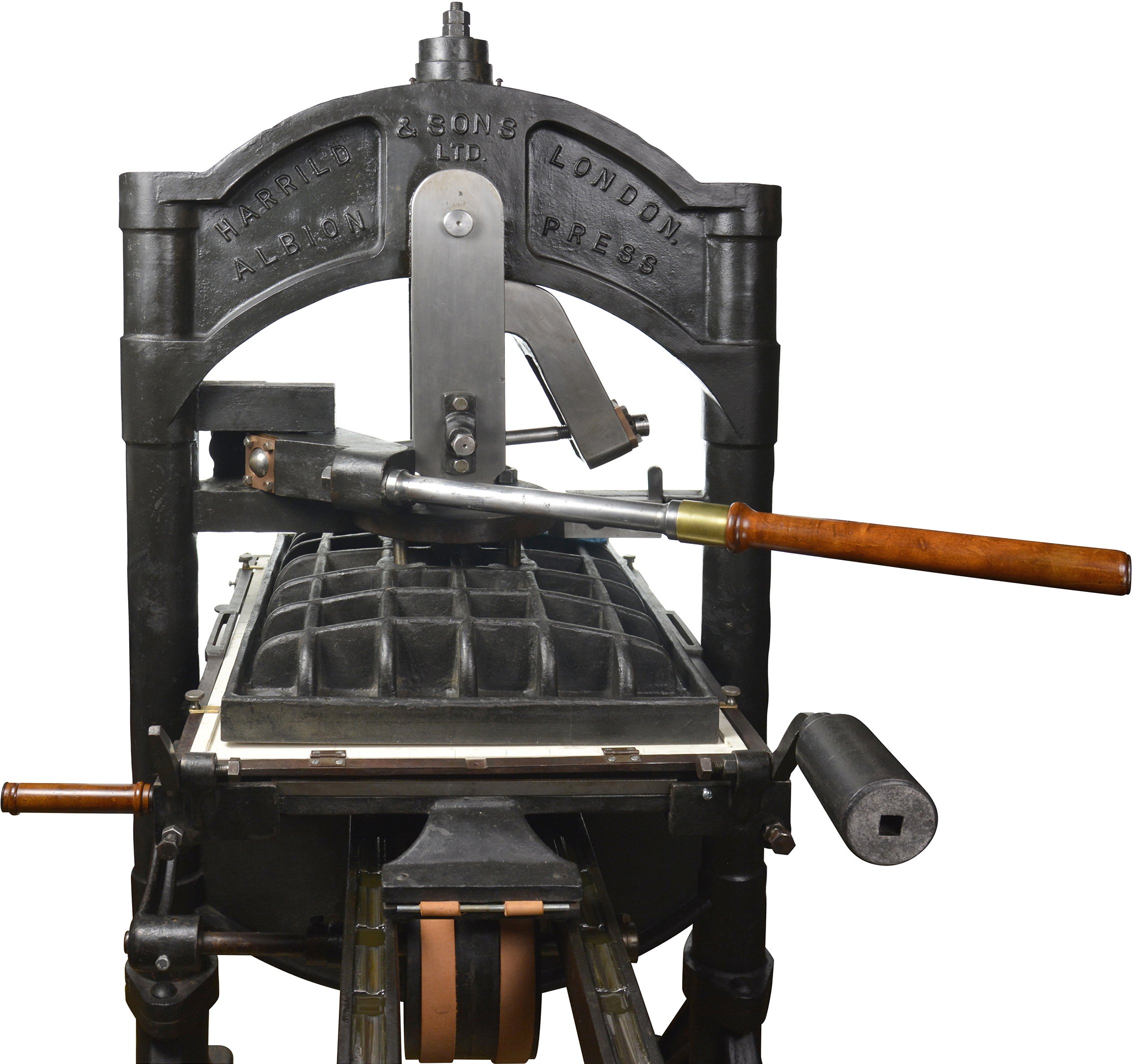
In the basement, there were 2 identical Albion iron hand presses. Not as fancy and ornate as Ian Mortimer’s, but it had the right words cast into the front of the printing press.
Harrild & Sons London. Albion.
I asked, “How much would you sell me one of the Albions.” Gardner said he didn’t want to sell it. I pressed him. Still, “No.” I pushed again, and he finally gave in and said he would let it go for $3,000. Remember that Jill has thirty $100 bills in her purse. I wished they had been in MY pocket so I could have just pulled them out. Gardner knew we were headed to Portland to buy an iron hand press, but pulling out the exact $3,000 would have been a very cool move.
We left the Museum of Printing and headed to Portland (about 100 miles) to get a motel. We would pack the R. Hoe Washington #5 iron hand press onto the trailer the next day and start home.
It was the middle of the summer, and apparently, many people visited Maine. There were NO vacancies anywhere starting about 20 miles from Portland, through Portland, and out the other side. We stopped at 9 motels.
We finally called Mike Kaylor to talk to his wife, Vickie, a travel agent. She looked into motels/hotels, and the nearest one to Portland that listed vacancies was near Fenway Park back in Boston, MA (they had 2). We called the same motel we had stayed the night before, and fortunately, they had a room. So, we drove from Portland, ME, back to North Andover, MA, and stayed in the same room as the previous night. The hotel gave us 30% off, which was a nice touch.
We got up the following day and drove back to Portland (now our third trip between the two cities) in 2 days to pick up the Washington #5.
Things went smoothly picking up the press, and the drive to Delaware was uneventful.
After most of our equipment, including the Washington #5, sat in our 1,000 square foot studio for a year, the owner still hadn’t received a “certificate of occupancy” for the building, which was a painful experience back when we wanted to get the studio started. Today, we are so thankful for the problems of moving into that space.
Lead Graffiti comes into being
In January of 2008, we started looking for a new space, finding one on our side of Newark, DE (8 minutes from our house), for the right price, in a much cleaner industrial park and a much better landlord, with windows, and 2,250 square feet of space. Also worth noting that we didn’t have to drive across the University of Delaware campus to get there.
In February 2008, we changed our name and officially opened “Lead Graffiti.”
The Albion comes on the market
A year goes by, and suddenly, on a Tuesday, we get a phone call from Gardner at the Museum of Printing. He says the museum is having some money problems and were we still interested in the Albion. The answer was no, but this would make a good story someday. Today as it happens.
I asked, “The same price?” He responded, “Yes.” I asked him when he needed it done. He said the sooner, the better. I said we would be up in 3 days on Friday. Given the opening part of this story, we headed back to the bank for another thirty $100 bills, which seemed like the right way to pay for the Albion.
We drove back up, stayed at the same hotel, same room, picked up the press using Mike Kaylor’s pick-up truck and trailer, and brought it home.
The provenance of the Albion
We asked a few questions about it, but the only thing Gardner seemed to remember was that he had bought the pair of presses in Pittsburgh. Eight years later, we wish we had asked a lot more questions.
And the Albion sat in Lead Graffiti from 2008 until near the end of 2015.
The American Printing History Association had its annual national conference in October of 2015 with the theme of “Printing on the Iron Handpress.” We had been slowly (emphasizing the word slowly) working on our two iron hand presses, but the conference injected a more intense sense of urgency. We were more interested in completing our Washington #5 as it had more problems. We needed to build a tympan and frisket. We also needed to fabricate a corner iron. We found a guy near Lancaster, PA, who restores cannons, like Revolutionary War cannons. We suspected he could make a corner iron. The main problem was it was at the hinge end and needed to mirror the other side as best as possible exactly. It’s a little off, but it works.
So, our effort moved to the Albion. We had chosen to buy one of the pair at the Museum of Printing which had the original frisket. It was all-metal, which seemed to save us a lot of effort and a fair sum of money.
We got the press set up reasonably well and brought in Steve Heaver from Baltimore, who has experience printing with an iron hand press, to do a workshop on setting it up and using it. We found a few others who would pay for the workshop, and we used that money to pay Steve for the drive and a day of his time.
The workshop didn’t go as smoothly as we thought it would as the press wasn’t set up correctly. When you look at the Albion, there isn’t much that you can change to alter how it works. It turns out it is a lot more complicated than that. Also, there is an internal spring that we thought might be broken or stressed, and getting it out so you can look at it is complicated. Some nuts and wedges need to be in the right place to adjust the delicate angle that the wedges take to apply the proper pressure on the platen after the handle is pulled at the appropriate distance.
The workshop went great, and we could understand what we thought we needed to do. Steve also showed us where the serial number was for the press, 8112, which started us on an excellent forensics journey worthy of an episode of CSI. A database online keeps track of the iron hand presses in the United States. None of the Harrild & Sons Albion have a serial number even remotely that high. The nearest one we’ve seen is 5488 without indicating the year it was made, but it takes a lot of years to build 2500 of them. The highest serial number with a date associated with it is 2851, made in about 1872.
A book we had purchased back when we first bought the Washington #5 was Richard-Gabriel Rummonds’ book entitled, Printing on the Iron Handpress. Over the previous 8 years, I had read nearly all of the 450-page book. The book is nicely illustrated with drawings of presses, parts, and demonstrations of techniques. Also, every 20 or so pages is a photo of someone printing on an iron hand press. I had loosely scanned the captions of the images, mostly noticing the names of printers I should start to store in my memory.
One day I noticed that one of the photos showed two printers working at two iron hand presses. The caption on page 124 reads,
Photo 14. Pressmen print The Catalogue of the Frick Collection on two Albion presses. Laboratory Press. Carnegie Institute of Technology, Pittsburgh, PA, 1949. (Reprinted by permission from American Printer, March 1950)
Two Albion presses! PITTSBURGH, PA!
The photo is quite dark with no details, which would indicate they were in the same style as our Albion. Still, the caption matches the only story element I knew of the two Albion presses while conjuring up another important question. What is the serial number of the OTHER Albion we left at the Museum of Printing?
A quick email to Ted (who helped us load our trailer with the Albion) requested they check out the other serial number. We had one photo we had taken the day we first looked at the Albion. You could “perhaps” make out “113”, but then you might be seeing what you want to see. Both Albion presses had been amateurishly painted with thick black paint. In our restoration of the Albion, we had stripped the color from the front of the piston on our press, exposing the serial number, maybe 1/4” high, which had been poorly hammered into the surface. We sent a photo of our press with the serial number circled to show him the placement. A couple of days went by, and we got the answer we wanted.
So, the presses were brothers, both from Pittsburgh. Not illogically, these are the ones from Laboratory Press. At this point, we decided we should read all of the captions in Rummonds’ book carefully and came across a second important photo on page 104.
Photo 13. Pressmen print The Catalogue of the Frick Collection on two Albion presses. Laboratory Press. Carnegie Institute of Technology, Pittsburgh, PA, 1949. (Photo courtesy of Cary Graphic Arts Collection RIT.)
This photo showed more detail in the legs and feet, matching our look. A quick email to the Cary Collection at RIT and a request to see if they could find the photo might even show the serial number. No such luck as they couldn’t locate the picture. We’ll leave that for another field trip.
In the meantime, we’ve finally gotten the Harrild & Sons Albion up and running. The pull of the handle feels right. The impression of pressure seems right. All of the pieces stay in the press and off the floor. The spring is fine.
An aside from the final work we did on the Albion is fun to tell. There is a long bolt running about half the width of the press. It has a rounded ball welded at one end and a round nut. Over the years, the threads under the round nut (which has 4 holes into which you can insert a large nail punch so you can turn it) had been beaten up pretty well.
Our letterpress studio is in an industrial park with some odd kinds of business. Across the street and up one building is A-F Machine Shop. I had walked in there once to see if they could cut me a very specialized bolt. They couldn’t. I decided to try again and walked over with the crossbar rod to see if there was any way to clean up the threads. Doug reached into his shirt pocket and pulled out a cardboard card that looked like it had been in that pocket since the early 1960s when Doug started there. He laid the card up against the threads and said, “7-8-9,” as if I would surely know what that meant. I said, “So.” He said, “A 7/8th inch bolt with 9 threads to the inch. Follow me.” He walked out into the shop, pulled open a giant metal cabinet's bottom drawer, reached way into the back, and pulled out a 7-8-9 tap and die set. He put the die on the end of the bolt, attached a handle so he could spin it, and started to turn it. It looked like it had come from the original machine that made it two minutes later. The bolt was so smooth you could spin it with one finger.
I asked how much I owed him. He said he had no idea. I said, “How about $20?” He said that was way too much. “Remember me the next time I walk through the door.” It wouldn’t be long for that to happen.
A couple of days later, we were confronted with another large bolt that had been banged against something solid. The resulting bend in the bolt seemed to be in precisely the wrong place to make the final subtle adjustments to the movement of the Albion’s platen. So, back to Doug’s.
He said to give him an hour, and in an hour, he was back. The bolt was perfect and could be adjusted to any position. “How much?” “$10.” I gave him $20.
Now we were in business with the mechanics of the press; we felt we had reasonable proof as to the provenance of the press, and things looked good. Things were getting ready to be a whole lot better than that. All through these final steps to get the Albion up and running, we posted the events and successes of our workshop, including the things we could find out about Laboratory Press.
It turns out Laboratory Press was the first fine press educational program in the U.S. The press was started in 1922 to complement the Carnegie Institute of Technology (later to become part of Carnegie Mellon University).
Chicago, January 2016
Jill and I had been asked to deliver the keynote talk to the Society of Typographic Arts in Chicago in January 2016. To help pay for the trip, we wondered if they would be interested in co-sponsoring a couple of workshops–one in letterpress based on the creative work of H.N. Werkman and one in bookmaking.
Stopping at Carnegie Mellon University
On our drive to Chicago, we stopped at Carnegie Mellon to see if they had anything to help us in our research. In Special Collections, we were introduced to a box with a complete set of Laboratory Press student projects (Porter Garnett, the program director, called them PROJETS). They gave us a brochure on Laboratory Press. Excellent information, though nothing could prove in a court of law that our Albion was from Laboratory Press.
In Chicago: the phone call
I walked around the letterpress shop at Columbia College during the letterpress workshop, and my cellphone vibrated. I pulled it out, and the phone number was from Illinois. Generally, I would ignore a phone call in the middle of a workshop, but I was from Delaware in Chicago, and I got a phone call from Illinois. I walked out into the hall and answered the phone.
Tim, researching Laboratory Press on the Internet, explained to me that his father had recently passed away and had been a student studying printing at Carnegie Institute of Technology from 1949 to 1952. While going through his father’s, things had come across a tube filled with proof sheets from The Catalogue of the Frick Collection.
“Excuse me. What?”
“Are you calling from Illinois?”
“Yes.”
“Do you know I’m in Chicago?”
“No.”
We set up to get together Sunday afternoon after the conference had ended and decided we would meet halfway, which turned out to be a 27-minute drive. We met in a restaurant, immediately clearing everything off the table and wiping it down. We started unrolling the tightly rolled proof sheets, and sure enough, right on top, “The Frick Collection” came into view.
Eventually, we hope to get a few of those sheets to keep with our press. On eBay, we found some keepsakes offered to the membership of some organizations and, as part of the keepsake, included a sheet with a typo that had been reprinted for the Frick Catalogue. We’ve since found another one.
Projets and eBay
We come back to Delaware and tell this story to anyone we can get to listen. Our letterpress friend, Bill Roberts, was down to spend a weekend, and we were layout the story out. He is fooling around with his phone while we are talking. He calmly says, “Do you know there are Laboratory Press Projets on eBay.”
“What?”
Sure enough. 25 of them. We look through the pieces when we get back to the house on a larger computer screen. Finding our favorite 2, we order them on “Buy now.”
The best one is “Achievement” by Charles Wesley Frew.
Just a killer piece of handset type like nothing I had ever seen. Breathtakingly stunning. Care in the hand composition borders on the miraculous.
It turns out that when you read the colophon of The Catalogue of the Frick Collection, it lists Charles W. Frew. The opening paragraph of the colophon reads.
The printing of these first volumes of the Catalog of the Frick Collection was begun in 1929 by Porter Garnett, who designed the text’s basic format and printed the sheets through page 168 with the assistance of Menno Shrock and Charles W. Frew. The work was laid aside in 1932.
Charles Frew had become the assistant to Porter Garnett. We picked the right student projet (correct spelling if you say it with a French accent) to buy. We wonder if the two printers in the photos from the Rummonds’ book are Manno and Charles. We are going up to the Frick Collection in New York City to see if they have any photographic material.
The story has gotten great, but it still has room for improvement.
The Albion : more detailed details
A book entitled Porter Garnett: Philosophical Writings on the Ideal Book was compiled by Jack W. Stauffacher and published by The Book Club of California in 1994. A visit to ABEbooks.com and it was ours. From a handwritten draft from the 1949 letter are the following two quotes. The first refers to setting up for printing of The Frick Collection Catalogue.
To this end, it was arranged that I should go abroad in the summer of 1929 with a rather specific program which may be stated as follows: To acquire (1) The best paper that could be acquired, English, Dutch, French, or Italian. (2) Type (in the required quantity and sizes, having classical purity, yet differing from other existing designs as those designs differ among themselves; in short, a distinguished and exclusive typeface. (3) Two hand-presses, the best to be had.
The second
While I was in London, I placed with Harrild and Company an order for two super-royal Albion hand-presses and conferred with Mr. (later Sir) Emory Walker regarding the making at a future date and with Mr. St. John Hornby regarding the binding of the volumes when completed.
Then in a letter of 2 January 1930 to Grace V. Bird, friend, and confidante.
What I have told you of the happenings of December 21st was sufficient for that day, don’t you think? But what happened the day before? Well, my two handpress were erected in Room 426 Frick Building. There I am established for the next three years, at least.
So, short of finding the receipt of purchase, which we are looking for at Carnegie Mellon University and the University of California, Berkeley, which holds Garnett’s archive, we have every reason to believe we have one of the two presses bought by Porter Garnett for the express purpose of printing The Frick Collection Catalogue. Wow.
Not the receipt, but we think we can now find it and final proof of the connection between Albion #8112 and Laboratory Press.
And that brings us to one more blog entry.

